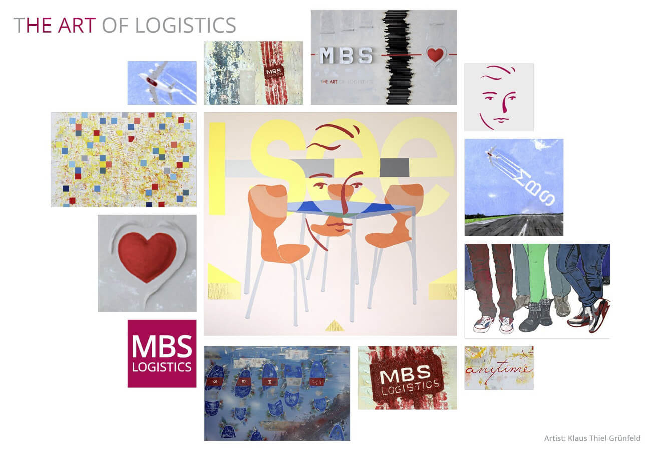
I SEE
Im Bildvordergrund befindet sich in der Bildunterhälfte ein Tisch ohne weitere Gegenstände mit drei um den Tisch arrangierten dreibeinigen Stühlen im Industriedesign (die drei Stühle symbolisieren die drei Buchstaben der Firma MBS, die mittels des Logos unbewusst ergänzt werden). Die unbesetzten Stühle sind in einem warmen orangefarbenen Farbton gehalten und kontrastieren mit der in Blautönen gehaltenen Tischplatte in einem Komplementärkontrast, der die Wirkung der Farben steigert.
Die Bildelemente I SEE und TISCH-STUHL-GRUPPE sind farblich wiederum so miteinander verwoben, dass deren jeweilgen Konturen mittels Farbabgrenzungen deutlich erhalten bleiben. Umrahmt werden die drei Stühle mit drei jeweils kleinen dreieckigen in wiederkehrenden Gelbtönen gehaltenen Bildelementen in der unteren Bildhälfte, die perspektivisch eine gewisse Räumlichkeit erzeugen.
Zentrales Bildelement ist das im warmen Rotton gehaltene „FACE“ als Logo der MBS, welches sich wiederum als verbindendes Element in der Bildmitte zwischen den beschriebenen Bildelementen in transparenterweise hervorhebt! Das Logo mit dem konturierten Gesicht steht als zentraler Baustein des Sehens im Sinne des Erkennens und erkannt Werdens.
Das graduell heller werdende Gelb im Schriftzug versinnbildlicht die steigende Transparenz in zwischenmenschlichen Beziehungen bei stetiger Offenheit und wachsendem Vertrauen. Der sich konträr hierzu verlaufende, dunkler werdende Streifen deutet auf eine tiefgründigere Basis hin, die eine Beziehung weiter aufbaut und dadurch im Wert gesteigert wird. Der Prozess einer Kommunikation ist eine geistige Entwicklung während des „einander Sehens“ und des „bewussten Sehens“.
Sichtbar und auffallend sind drei leere Stühle, die eher auch an coronabedingte Umstände erinnern mögen, aber ihr einladender Charakter fordert dazu auf, „besetzt“ zu werden (die Gestaltungslehre sucht immer nach Ergänzungen, hier: Stuhl – Mensch). Besetzt zu werden im Sinne einer aufrichtigen Kommunikation sowohl zwischen den Mitarbeitenden untereinander und erst recht zwischen Mitarbeitenden und Kunden. Und erst dann werden die anstehenden Themen „auf den Tisch gelegt“, um kunden- und lösungsorientiert zu kommunizieren.
Diesem Umstand wird „Raum und Zeit“ gegeben, sei es in analoger oder digitaler Form, um vertrauensvolle Zusammenarbeit zu ermöglichen. Dies wird in dem Logo (FACE) eines aufrichtigen Sehens, eines „Ansehens“ auf Augenhöhe und eines „erkennenden“ Sehens zum Ausdruck gebracht mit der bewussten Aussage: I SEE!